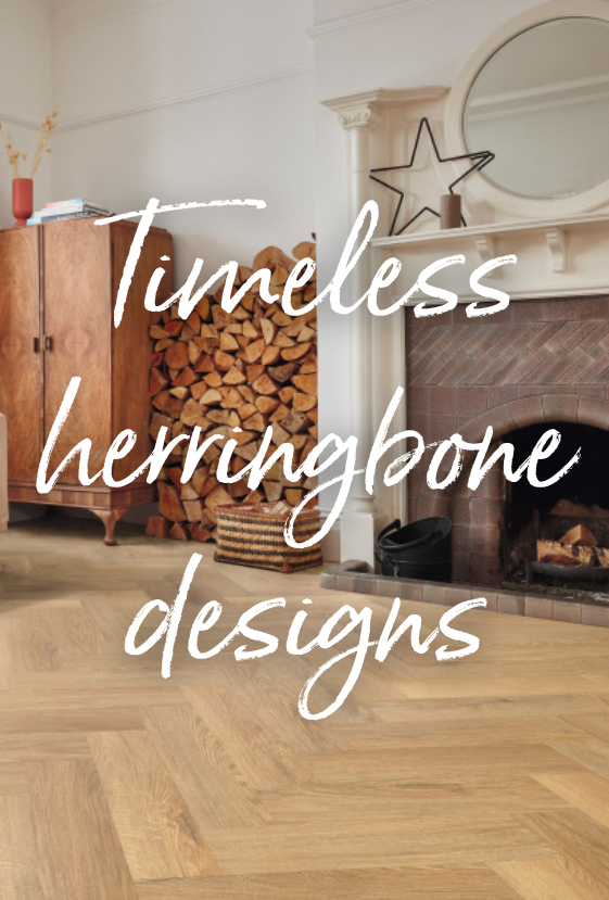


There’s no mistaking it, colour is big this season! From colour drenched rooms that wrap you in warm sensations and contrasting colours in bold patterns to playful individualistic styling, the dopamine décor trend is enabling us to truly express ourselves.
Dopamine, often called the ‘happy hormone’, is a chemical our brain releases when we experience something pleasurable like eating our favourite food, winning a competition or surrounding ourselves with colours we love. So, at the heart of the latest style is the principle that your home should make you happy and relaxed. Balance your choice of joyful colours with the wellbeing benefits of a nature inspired floor and you’ll have a guaranteed recipe for success.
Simply be you
When our Instagram feeds are packed with colourful images, it’s tempting to take the same approach in our own homes but the secret to a liveable home is to find your own style. Will bold clashing colours make you happy or would a more subtle approach suit your personality?
Look to your wardrobe. Is it full of bright colours that make you smile when you wear them? If so, the dopamine décor trend could be for you. Pick out a selection of your favourite colours and test how these feel in your home with accessories and soft furnishing. If you love the effect, keep adding layers of colour until your spirits soar.
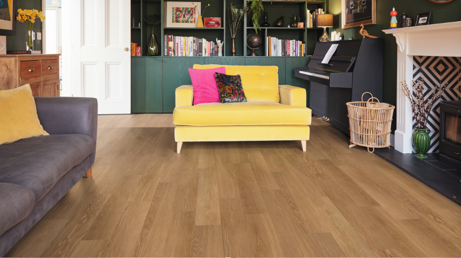
In this living room, bright blue, fuchsia and yellow velvet are balanced with forest green and our Honey Limed Oak.
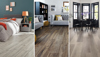
Two tone simplicity
You don’t have to combine lots of colours to get the dopamine effect. For a more minimalist approach, choose two colours on opposite sides of the colour wheel. Lift your room beyond the ordinary by contrasting green with red, blue with orange, purple with yellow. Or take a more subtle, relaxing approach with colours that are at right angles to each other such as blue and pink, or sit next to each other like lilac and pink.
The secret is to ensure that your colours have similar warm or cool undertones. Then, to soften the effect, balance bolder colours with plenty of neutral space such as a complementary blond wood or grey stone design flooring.
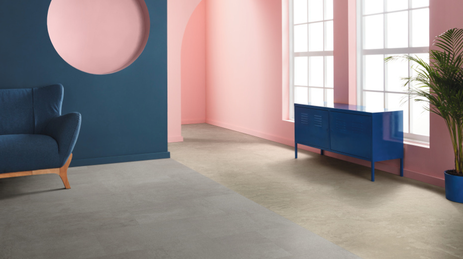
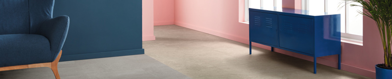
This room features cool blue and pink with the neutral grey of Roman Slate and the beige of Tortora Breccia Marble.
Botanical pattern
Fun patterns are the perfect way to introduce interest and cheer. Mix and match your favourites, from zigzags, stripes and dots to oversized animal prints. Why not use a repeating botanical patterned wallpaper on all walls then choose a contrasting colour for woodwork and built in cupboards.
Appeal to all your senses by including tactile surfaces that you can’t help running your fingers over. Look to cosy fabrics such as velvet, bouclé or woven rugs. When it comes to flooring, our wood designs have an authentic look and natural grain texture you’ll be amazed isn’t the real thing.
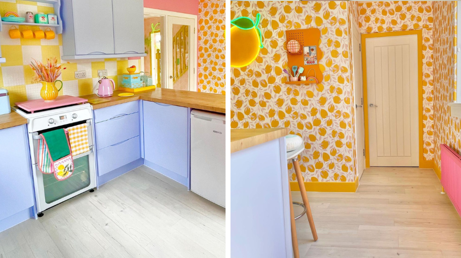
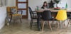
Rachel Henderson @therachelhendersonstudio was inspired by an orange print wallpaper to use a collection of bright pastels in her kitchen, balanced by the cool fresh tones of Washed Scandi Pine (also available in herringbone).
A touch of whimsy
Paying attention to small details will help you personalize your space and create an element of surprise. Perhaps you’re inspired by your travels to exotic destinations or you have an unusual collection of vintage items. Highlight these very personal aspects with pops of colour, humorous patterns or perhaps a bespoke mural.
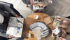
Siobhan Murphy of @interiorcurve is a self-confessed ‘more is more’ maximalist but when she updated her home’s generous landing, she created a chilled out mid-century inspired scheme in soft pink and lavender. Adding an Auburn Oak parquet floor has introduced a timeless pattern and a warm foundation, while a bespoke mural and Japanese themed rug add unexpected whimsical touches that elevate her space.
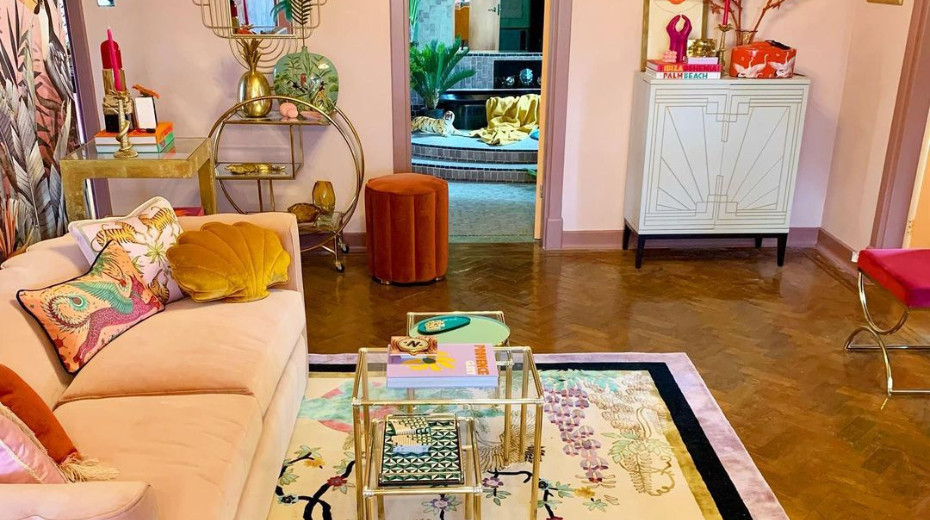
Siobhan Murphy’s (@interiorcurve) maximalist home features our Auburn Oak parquet.
Grab your free samples and find a floor that perfectly complements your happy colour palette.