


Inspired by the healing properties of nature, more and more of us are using these nurturing colours and textures in our homes to create welcoming sanctuaries which support our health and wellbeing.
A neutral colour scheme is guaranteed to lower your blood pressure and lift your heart. Think earthy browns in mushroom grey and clay with accents in delicate botanical greens such as cool sage and pistachio or muted lavender and baby pink pastels.
At the moment there’s a rather retro feel to the way designers are bringing together these soft neutral tones but it’s far from bland or predictable. By laying up a room with interesting textures such as boucle cushions and tufted rugs, artisan accessories and dried flower arrangements, your home can cocoon you in contentedness and serenity.
When it comes to flooring, the secret to success is a realistic look that’s also highly practical and hard wearing. Here are five of our favourite floors to enhance a neutral palette:
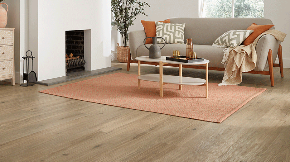
1. Van Gogh Country Oak
Strong sunlight can leave colours looking washed out so in south facing rooms it’s a good idea to opt for a floor design that can hold its own. Country Oak features a gentle mix of cool greys with warm mid-toned browns and authentically rustic grain details. The traditional appearance of this floor creates the perfect juxtaposition with modern minimalist furniture and bold accent colours.
Country Oak from our Van Gogh collection available in a gluedown and rigid core fitting format.
2. Korlok Canadian Urban Oak
Canadian Urban Oak is a mid-toned design that can carry the higher light levels of a sunny room. Its deep blond colouring has been lightly brushed for a soft effect that provides an ideal neutral backdrop. Here we have combined its natural textures with white paintwork, light beige furnishings and accents in warm clay and sand.
Canadian Urban Oak from our Korlok collection.
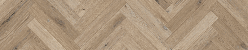
3. Knight Tile Washed Character Oak
Lighter in tone, Washed Character Oak from our Knight Tile range has a muted taupe colour palette that is ideal for pared back spaces. Inspired by planks reclaimed from an old wind-powered sawmill in Amsterdam, this flexible design has a rustic age-smoked look that gives it plenty of character.
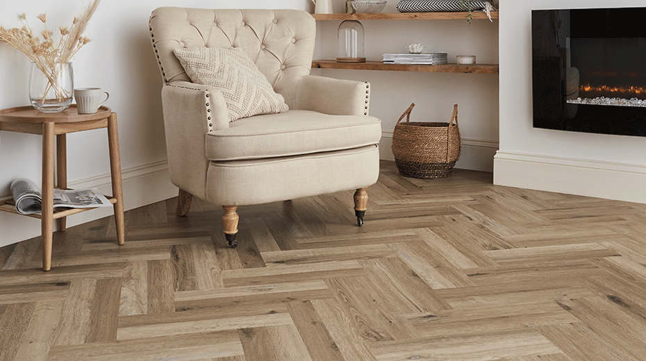
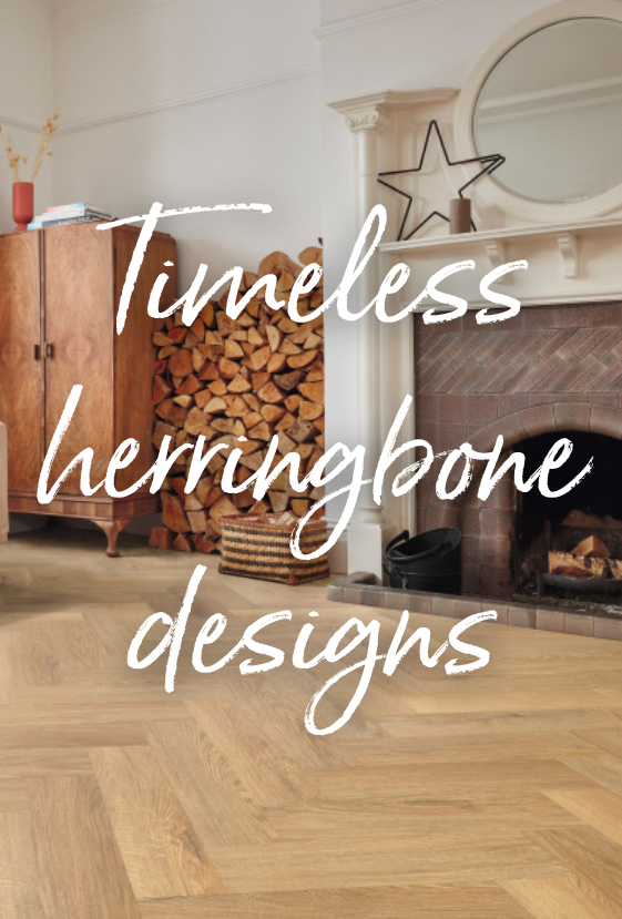
Washed Character Oak in a small plank herringbone. This design is also available in a full sized plank in gluedown and rigid core fitting formats.
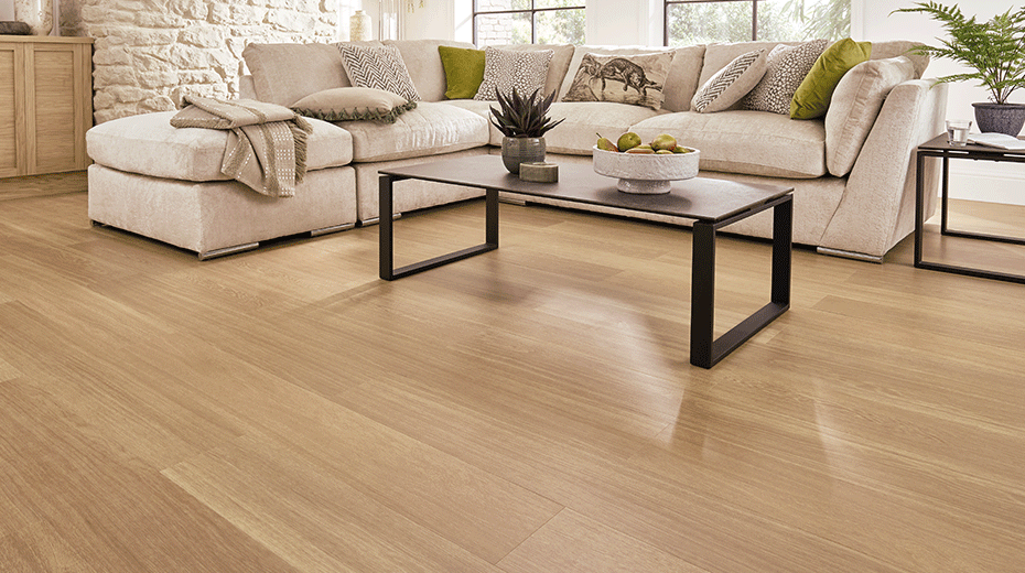
4. Opus Niveus
In rooms that receive indirect sunlight or direct light for only part of the day, using a warmer colour palette with more robust neutrals will lift the lower light levels and create a cosy atmosphere. Here we have paired a warm stone brown with the pinky-brown tones of Niveus. Its subtle limed effect glows in the weaker light levels while distinctive grain details add texture and visual interest.
Niveus from our Opus collection.
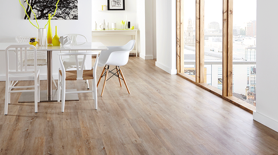
5. Van Gogh Natural Prime Oak
A classic light oak design that offers a warm neutral background, Natural Prime Oak from our multi-format Van Gogh collection is a great choice for spaces with lower light levels. The soft sandy tones and gentle grain details add a sense of comfort and reflect the available light around the room. Here we have combined white walls, cream furnishings and blinds with dark metallic and olive green accents.
Natural Prime Oak from our Van Gogh collection available in a gluedown and rigid core fitting format.
Which is your favourite neutral? Why not share your next project with us on Instagram @karndean_uk?