


We’ve all appreciated summer’s last fling and some welcome September sunshine but now there are undeniable hints of autumn with a cooler nip in the air and the first leaves on the breeze. So, just as squirrels are putting the finishing touches to their winter food hoards and our precious pollinators crawl into hollow stems and under leaf piles, it’s no wonder we’re all feeling the urge to create a cosy space where we can rest and reflect.
By decorating our homes in soft organic colours with warmer red tones we can add a comfortable and welcoming feel that will cocoon us and help us make the most of this rejuvenating time of year. We look at the floors that will perfectly complement this season’s top colours.
Autumn leaves
Nothing creates a cosy feel like the warm shades of an autumn woodland. Think fiery reds, hot mustard, brown bark, lichen and plum. Mix these colours with layers of cosy fabrics like tweed and knits, tactile timeworn surfaces and a cup of hot chocolate in front of a roaring fire and you have a guaranteed recipe for a relaxing retreat.
A flooring with aged rustic character that adds a twist on classic style would be the perfect complement for your autumn inspired space. Like Reclaimed Chestnut from our Art Select range which comes in a random plank size option to authentically reproduce the look of an ancient barn floor.

Reclaimed Chestnut from our Art Select collection paired with Farrow & Ball’s Incarnadine, Calke Green and Dulux Honey Mustard.
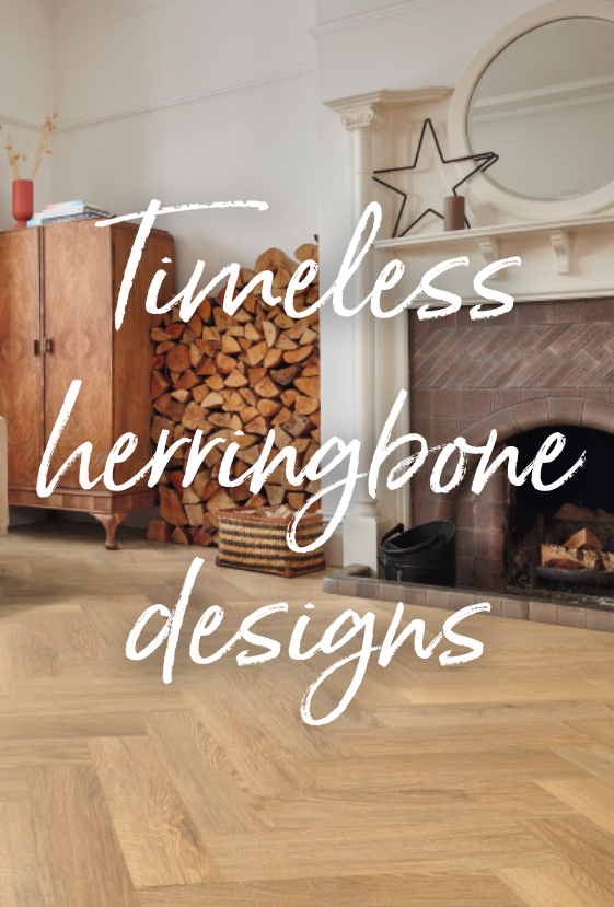
Eye-catching pattern
Wallpaper is back in a big way with organic patterns from subtle foliage to oversized florals. To get this bold autumn look, choose your favourite print in earthy colours such as turmeric and terracotta and let pattern take the limelight.
For plenty of nature inspired comfort, pick out a few of the colours from your wallpaper for walls or painted furniture then add layers of texture, from sheepskin throws to fluffy cushions. When it comes to flooring, a wood design with a wide variation of colour from plank to plank will be able to hold its own against a lively print. Look to our collection of authentic oak designs such as Traditional Character Oak herringbone from our Knight Tile range.

Traditional Character Oak from our Knight Tile collection paired with Dulux Honey Mustard, Farrow & Ball Picture Gallery Red and Graham and Brown Florenzia Dusk Wallpaper.
Softly neutral
Warm neutrals are the biggest story of the year, from the palest off-white whispers to greige stone, muted taupe and deep chocolate brown. Keeping things light and airy, this is a serene and enduring style that is super easy to live with.
Highly versatile with timeless appeal, warm neutrals bring the beauty of nature into our homes whilst giving us scope to reflect our unique story with eclectic treasured possessions. Choosing a blend of several harmonious shades will create an interesting layered effect that is as uplifting as it is soothing. Then add depth and balance with a rich wood design floor in a simple straight lay pattern such as Boston from our Karndean LooseLay range.

Boston from our Karndean LooseLay collection paired with Coat Paints' Buon Fresco, Sheldon and Mindful.
Warm grey
Grey remains the nation’s favourite neutral but this autumn we’re seeing a shift to warmer tones featuring gentle hints of red for a softer more calming result, especially in rooms that get less natural sunlight.
For best results, combine your chosen grey with other warm tones such as blush pink, sage green or blues with a hint of yellow and a matt earthy flooring such as Bronze Castello Marble from our Van Gogh range. Then add fluid lines and luxurious textures such as velvet and buclé for a look that’s indulgent yet understated and oh so relaxing.

Bronze Castello Marble from our Van Gogh collection paired with Farrow & Ball’s De Nimes, Setting Plaster and Elephant’s Breath.
Gentle teal
From the light green tones of aquamarine to the bold green-blues of forest pine, teal is a grounding colour that will bring a sense of optimism to any space.
Whether you choose an accent panelled wall, an all over colour drenched effect or pick out your favourite shade in curtains and soft furnishings, this is a colour palette that will instantly ease tensions. Keep the chilled out vibe going by combining teal with a blend of creamy off-white and beige neutrals and a warm wood design flooring like our Van Gogh Glenmore Oak. Conveniently, this is a floor that comes in a choice of plank sizes and formats so you can have the style you prefer even if your subfloor is less than perfect or still drying.

Glenmore Oak from our Van Gogh collection paired with Little Greene’s Joanna, Pleat and Aquamarine-Deep.
Find more autumn inspiration on our Instagram @karndean_uk.