
The major paint and color influencers have announced their 2020 colors of the year – and for the most part we’ll be swimming in a sea of blues! In interior design, blue hues are generally known to create a calming and relaxing atmosphere, reflecting the lifestyle trend toward self-care. Let’s explore these leading colors, how you can incorporate them into your home, and what Karndean Designfloors pair well with them.
Sherwin Williams: Naval
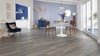
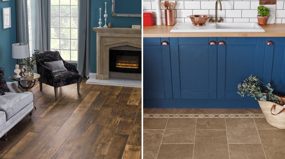
The theme of calm, grounded colors begins with Sherwin Williams’ 2020 color, Naval. This “roaring navy” combines the opulence of Art Deco with the “awe-inspiring power of nature” to signify an empowering new year and decade.
Because this color has many different meanings (calm, confidence and a connection with nature) and isn't too bold, you could use this color in practically any room. A helpful tip when using a dark wall color is to make sure your room has plenty of natural light to balance the mood of the room or pair with light furnishings.
Salvaged Barnwood herringbone planks SM-RKP8209
We can envision Naval paired with many of our flooring choices. Some of our favorites include Salvaged Barnwood, a highly characterful floor with a wide range of brown hues, to amp up the drama. If you’d like a lighter color to brighten and add balance to your space, Vanilla Oak is a minimalistic, clean-lined visual while Aged Redwood has more rustic charm. If you wish to play up the Art Deco theme or prefer a stone visual, the metallic finish and steely charcoal base of Ferra fits this style.
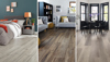
PPG Paints: Chinese Porcelain
The trend of blue hues continues with PPG Paints’ Chinese Porcelain, “a blend of cobalt and moody, ink blue that imparts calmness and restful sleep while also offering the spirit of hopefulness.” This color is meant to offer an escape from our technologically driven culture. As a muted navy tone, Chinese Porcelain can function as the main color of a space or can be a backdrop against which brighter colors can really pop. If you found Naval to be too dark, you may prefer Chinese Porcelain.
Reclaimed Chestnut EW21, Sable CER16 with Davyne border and beige feature strip
Because this shade of blue is lighter, you can pair it with floors that have yellow and beige tones. If you plan to use Chinese Porcelain in a kitchen or bathroom, our limestone-inspired Sable tiles provide a neutral base that allows the blue to be the focus. If you like a traditional wood look or one with more rustic character, Reclaimed Chestnut’s golden highlights draw out the color of Chinese Porcelain, however you choose to use it in your space. You could also select floors with gray undertones, like our Baltic Washed Oak or Shadow Fabric Oak, whose tones drift between gray and beige.
Pantone: Classic Blue
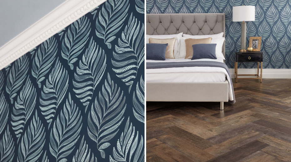
Classic Blue aspires to be a calming influence and beyond - a “dependable and stable foundation on which to build as we cross the threshold into a new era.” As a new decade begins in 2020, this color evokes inward reflection and the opportunity to re-center ourselves. Given the meaning behind this color, you may wish to incorporate it in your bedroom or bathroom décor or textiles for its calming effects or in a home office to inspire fresh thoughts and to quell work-related stress levels.
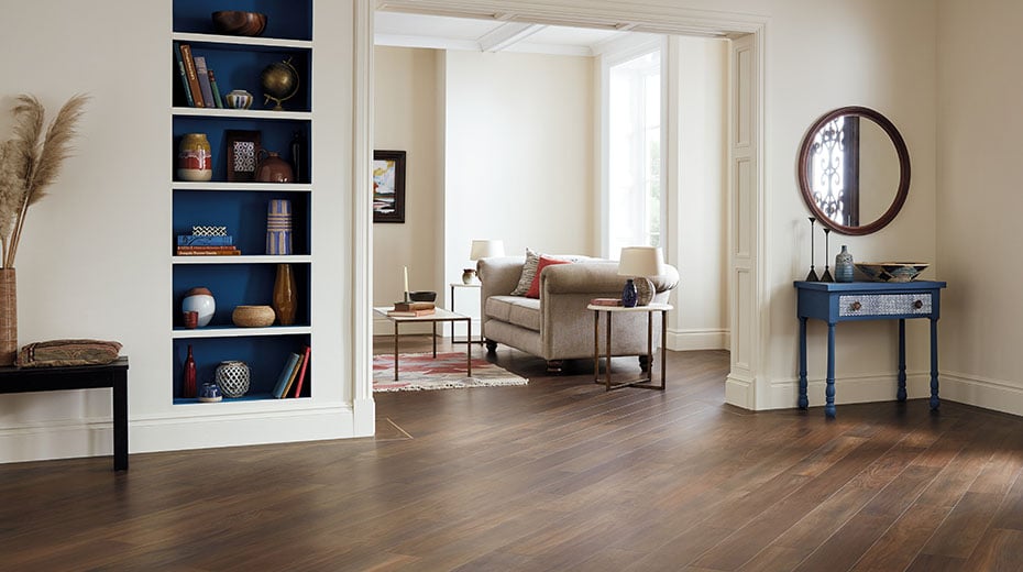
Natural Walnut WP326 (also shown in header image)
When pairing Classic Blue with flooring, look to colors with slightly cool undertones, like Natural Walnut, an overall traditional floor with chocolate brown hues. If your style is more contemporary, Smoked Koa provides a beautiful gray backdrop, while Carbon’s weathered steel visual complements a more industrial aesthetic. If you prefer to brighten your space with a lighter floor, Lemon Spotted Gum has cool, crisp lines.
Behr: Back to Nature
If blue isn’t your color of choice, or perhaps it doesn’t coordinate with your existing décor, these next two colors offer an alternative. Get “Back to Nature” with an invigorating, yet muted shade of green by Behr that reflects our need for nature’s calming influence and sense of balance in life.
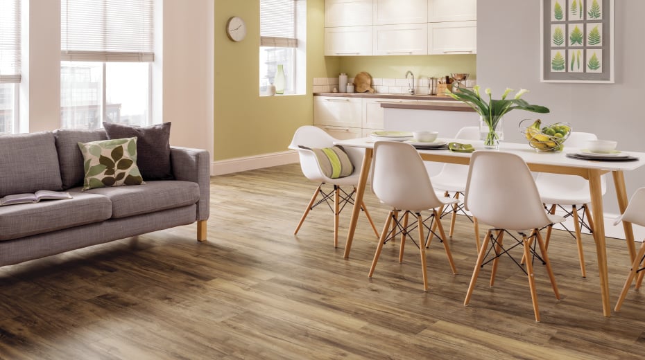
This color can be easily paired with woods that have golden tones, including Stamford or Warm Ash, or you could make it pop by pairing it with our White Painted Pine. You may also choose a complementary gray-brown tile look - we especially like it against [Santi Limestone], which has a swirling pattern that can add texture to your space.
Benjamin Moore: First Light
Benjamin Moore aims to provide an alternative to white or beige with a “refreshing wash of pink” called First Light. The name itself evokes a connection with nature, reminiscent of a hue you would see in the early morning sky. This shade could easily be incorporated into homes with minimalist or Scandinavian-influenced styles.
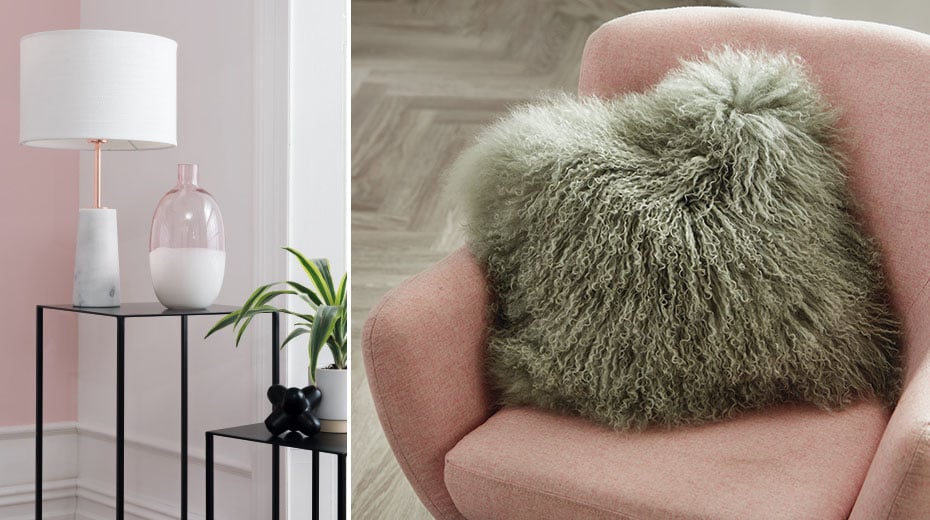
One characteristic of Scandinavian style is clean lines and lighter color tones. So if it’s Scandi style you’re after, pair First Light with Glacier Oak or Texas White Ash, which each have simple lines and rosy undertones. For a understated, yet sophisticated stone visual, try our Grey Riven Slate. If you plan to simply use First Light as an accent color and prefer the floor be the focus, our Weathered American Pine will add character to any room in your home.
No matter which 2020 color of the year you chose to incorporate into your home, these colors will calm, center and inspire! Be sure to follow us on social media and share how you’ve used these colors throughout the year!